React Bootstrap is a JavaScript library that provides pre-built components for React.js applications. These components are built on top of Bootstrap, a popular CSS framework for building responsive, mobile-first websites.
An "image component" in React Bootstrap refers to a specific component that can be used to display images in a React application. This component is built using the Bootstrap classes and can be easily styled to match the design of the application. The React Bootstrap library provides a <Image> component, which allows you to add images to your application, with options for responsive images, alignment, and more.
It's important to notice that React Bootstrap is not an official library from Facebook (React's creator), It's a third-party library that allows you to use Bootstrap's styling in React.
How to create images with react bootstrap?
There are a few ways to create images with React Bootstrap, depending on the specific use case.
- Using the
<Image>component: This is the most common way to create images in a React Bootstrap application. You can use the<Image>component to display an image by specifying the source of the image using thesrcattribute. You can also specify other attributes such asalt,width, andheightto control the appearance of the image.
import { Image } from 'react-bootstrap';

<Image src="image.jpg" alt="Description" width="100%" height="auto" rounded />
2. Using the <Card.Img> component: If you want to create an image card, you can use the <Card.Img> component within a <Card> component.
import { Card } from 'react-bootstrap';

<Card>
  <Card.Img src="image.jpg" alt="Description" variant="top" />
  <Card.Body>
    <Card.Title>Image Card Title</Card.Title>
    <Card.Text>
      Some quick example text to build on the card title and make up the bulk of
      the card's content.
    </Card.Text>
  </Card.Body>
</Card>
3. Using the background-image CSS property: In some cases, you may want to use an image as a background for a specific element. You can use the background-image CSS property to set an image as the background of an element.
import './styles.css';

<div className="image-bg" style={{ backgroundImage: `url(${image.jpg})` }} />
with styles.css
.image-bg {
  background-size: cover;
  background-position: center;
  background-repeat: no-repeat;
  height: 400px;
}
Note that you must import the React Bootstrap library in your application before you can use the <Image> component or other components provided by React Bootstrap.
Question and Answers About Bootstrap Image Component
Some common questions and issues related to the Bootstrap image component include:
How do I make an image responsive?
- Use the
img-fluidclass on the<Image>component to make the image responsive.
How do I add a border to an image?
- Use the
img-thumbnailclass on the<Image>component to add a border to the image.
How do I center an image?
- Use the
text-centerclass on a parent element of the<Image>component to center the image.
How do I change the shape of an image?
- Use the
img-*-shapeclasses on the<Image>component to change the shape of the image. (e.g.img-rounded,img-circle,img-thumbnail)
How can I add some caption or title to my image
- You can use
<figure>and<figcaption>elements wrapped around the<Image>component, or use<Card.Img>component within a<Card>component - How can I make an image clickable?
- You can wrap the
<Image>component inside an<a>tag, to make the image clickable, linking it to a specific URL.
<a href="https://example.com">
  <Image src="image.jpg" alt="Description" width="100%" height="auto" rounded />
</a>
- How can I make a gallery of images?
- You can use the
<Row>and<Col>components to create a grid of images, then wrap the<Image>component inside each column.
import { Image, Row, Col } from 'react-bootstrap';

<Row>
  <Col xs={6} md={4}>
    <Image src="image1.jpg" alt="Image 1" thumbnail />
  </Col>
  <Col xs={6} md={4}>
    <Image src="image2.jpg" alt="Image 2" thumbnail />
  </Col>
  <Col xs={6} md={4}>
    <Image src="image3.jpg" alt="Image 3" thumbnail />
  </Col>
</Row>
It's important to note that these are just a few examples, and there are many other ways you can use the Bootstrap image component to create different types of images in your application.
React Boostrap Documentation
Documentation and examples for opting images into responsive behavior (so they never become wider than their parent) and add lightweight styles to them—all via classes.
Shape
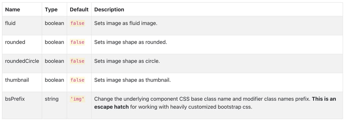
Use the rounded, roundedCircle and thumbnail props to customise the image.
Fluid
Use the fluid to scale image nicely to the parent element.
API
Image
import Image from 'react-bootstrap/Image'
Copy import code for the Image component

Related Links:


